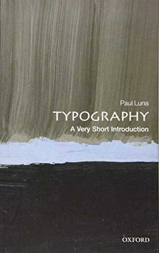
Typography: a Very Short Introduction
Typography, the art of designing printed words, was once the domain of an elite few artists but has become an area with which millions of people engage daily. The widespread usage of digital devices from laptops to tablets and smart phones which are used for written communications means that we are regularly asked to make decisions about the fonts, sizes, and layouts we use in our writing. This broadening engagement with the field of typography has led to a perceptible shift from debates about legibility and technicalities to conversations about which fonts best reflect the writer's personality or style. In this Very Short Introduction, Paul Luna offers a broad definition of typography as design for reading, whether in print or on screens, where a set of visual choices are taken to make a written message more accessible, more easily transmitted, more significant, or more attractive. Considering the development of letterforms and the shapes of letter we use, Luna discusses the history behind our modern day letters and fonts, before considering the issues behind key typographic decisions, and the differences between printed and on-screen typography. Presenting any piece of typography as a fundamental design choice, Luna introduces the options available today, and explores the reasons why key typographic decisions are made. ABOUT THE SERIES: The Very Short Introductions series from Oxford University Press contains hundreds of titles in almost every subject area. These pocket-sized books are the perfect way to get ahead in a new subject quickly. Our expert authors combine facts, analysis, perspective, new ideas, and enthusiasm to make interesting and challenging topics highly readable.