In print
Ebook
Audiobook
Library
We may earn a commission. Learn more.
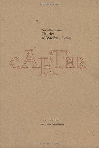
Typographically Speaking The Art of Matthew Carter
In a career that has spanned more than forty years, Matthew Carter has designed many of the typefaces that we see every day in and on publications, books, signs, and screens. Carter's celebrated typefaces include such stalwarts as Galliard, Mantinia, and Verdana. In 1975, he created the now-pervasive Bell Centennial specifically for use in phone books. Publications including Sports Illustrated, the Daily News, Wired, and the Washington Post, along with cultural institutions such as the Walker Arts Center and The Victoria & Albert Museum, have all commissioned Carter fonts. Typographically Speaking: The Art of Matthew Carter entered the field in the days of hand-cut punches and hot-metal type, and has continued to innovate through the eras of photocomposition and digital design. Essays discuss the form of his work, his position and use of typographic history, and his technological innovation. All of his fonts are reproduced in full for reference, and illustrations place his designs in context. Published in conjunction with the University of Maryland Baltimore County.
No reviews yet.
Be the first to write one.
No highlights yet.
Be the first to share one.